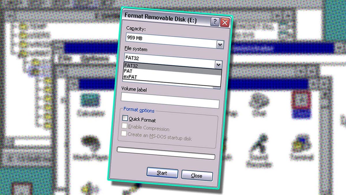
It turns out that a small but useful menu inside your modern Windows PC was designed and built in one day in 1994. It was meant to be a temporary stopgap until something better was created to replace it. That never happened, and now, 30 years later, the guy behind that original menu has revealed the story behind it.
If you’ve used a Windows PC in the last 20+ years and had to format a storage drive, you’ve likely encountered the “Format Disk” menu box. It’s a nondescript, simple, barebones, but totally usable menu that lets you reformat drives using different options. The various options are laid out vertically and use drop-down menus. There’s also a start and close option and…uh, that’s it. And this functional but basic menu hasn’t changed in over three decades, according to longtime Microsoft programmer Dave Plummer.
On March 24, Plummer posted a lengthy but interesting tweet explaining the history behind the Format dialog box and why it looks like that and has those features laid out in that vertical manner. According to Plummer, he wrote up the design of this Format menu on a rainy Thursday morning at Microsoft back in late 1994. The famed programmer says he and the team were at the time porting a “bajillion” lines of Windows 95 user interface code to Windows NT. When it came time to create a UI for Windows NT’s Format feature, the two operating systems were just “different enough” that Plummer had to come up with some new, custom UI.
“I got out a piece of paper and wrote down all the options and choices you could make with respect to formatting a disk, like file system, label, cluster size, compression, encryption, and so on,” explained Plummer in his tweet.
“Then I busted out VC++2.0 and used the Resource Editor to lay out a simple vertical stack of all the choices you had to make, in the approximate order you had to make. It wasn’t elegant, but it would do until the elegant UI arrived.”
Here’s the thing: That better, “elegant” UI option never arrived. 30 years later, Plummer says the dialog option seen in modern Windows is still the same one he designed and created on that day in 1994. “Be careful about checking in ‘temporary’ solutions,” added Plummer.
What’s funny is even a lack of consistency in the menu’s colons—some options have them, others don’t—was kept in the final version and remains in the Format Disk box to this very day. However, Plummer hinted (jokingly) in a follow-up reply that this “bug” might finally get fixed. (Oddly, the colon consistently is correct in the German version of Windows 11. Huh!)
Oh, and according to Plummer, he was the one who decided on constraining the format size of a FAT volume to 32GB. And that decision was a totally “arbitrary choice” he made that same rainy morning.
“So remember… there are no ‘temporary’ check-ins,” concluded Plummer.
.


