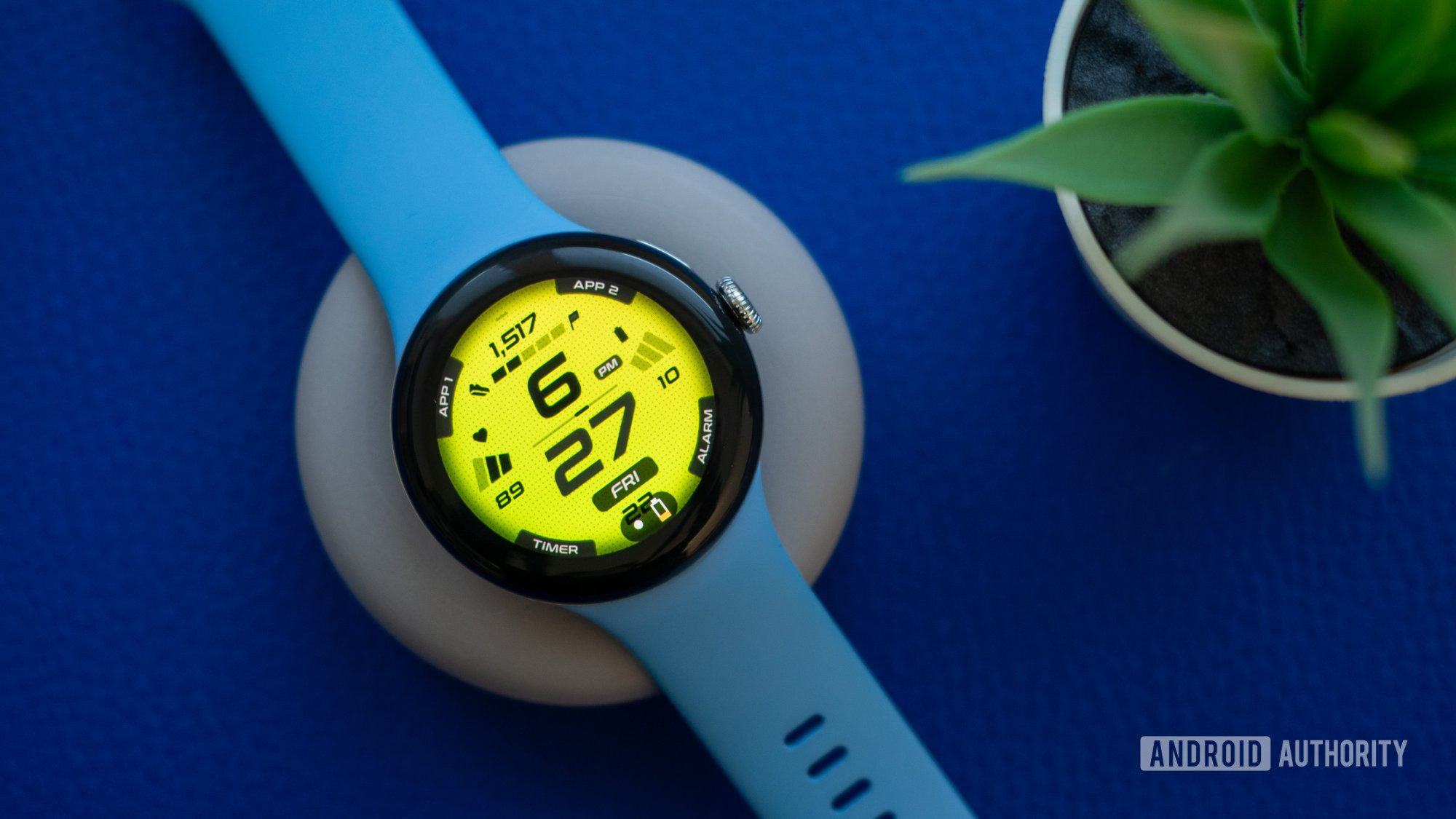
For the past few years, I’ve been avoiding using third-party watch faces on my Galaxy Watch and Pixel Watch because they’re just frustrating all around. Most third-party watch faces are slow, heavy, and poorly designed, and it’s tough to find one that works well. Worse yet, they often drain the battery very fast, they don’t show proper health stats and data, and sometimes they also want me to install a companion app on my phone for some reason.
But things are changing thanks to Google and Samsung, and third-party Wear OS watch faces have started to get better, and I’ve found 10 favorites to share with you.
How did third-party watch faces get better?
Rita El Khoury / Android Authority
Before I share my favorite faces, let me explain how third-party watch faces started getting better. In May of last year, Google announced Watch Face Format, a preset template for watch face designers. It’s already integrated in Samsung’s Watch Face Studio, too, so developing with it should be quite easy.
Basically, if you’re a developer, you should adopt this format to make sure your watch face behaves like a native one on any modern Wear OS watch. It won’t drain the battery more than necessary; it will show people their health data and stats properly; it will be customizable directly on the watch and inside the Pixel Watch app for those who have that watch. And it will generally have a smaller installation size because it’s essentially an XML file. Better yet, it won’t require a companion app on the phone, and you won’t need to keep updating it to apply battery and performance optimizations all the time — the Wear OS platform handles all of that.
Faces developed with Watch Face Format behave like a n
So what’s the catch? Well, because they follow a set of parameters made by Google, watch faces developed with this format generally look a bit basic and similar to each other — unless the designer has gone to great lengths to make theirs look unique.
They’re also very tough to find. There’s no dedicated section in the Play Store to discover faces developed with Watch Face Format, and it’s not easy to tell if a face uses the format unless the developer explicitly mentions it somewhere.
But I did the digging for you and found 10 different, cool, and interesting watch faces built by different developers on top of Watch Face Format. These should work with your Pixel Watch 2 and 1, Galaxy Watch 6, 5, and 4, OnePlus Watch 2, and any other watch running Wear OS 4.
Awf Sport xR by AmoledWatchFaces
Rita El Khoury / Android Authority
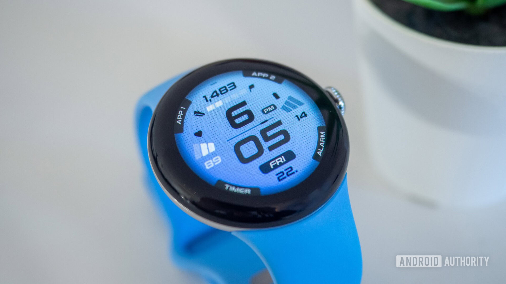
Let’s start with my favorite digital watch face at the moment: Sport XR by Amoled Watch Faces. The bright gradient colors and dotted pattern in the background caught my eye when I first saw this face, and I still find them utterly cool now. I keep switching between the different shades of blue that fit my Pixel Watch 2’s band, but I’ll be honest: The green, red, and orange shades are spectacular too.
The heart rate complication on the left is fixed here, but since I always choose that on any watch face, I don’t mind it at all. The right and top stats are customizable, though, and all four app shortcuts too. The only downside is that I can’t change the text on the corners, so I have to remember that I set App 1 to Spotify, App 2 to Google Home, and Timer to Google Pay. At least I set the Alarm to my Alarm!
And for the Always-on Display, you can show everything, but I opted for the simple clock-only design.
Nothing Fancy by Time Flies Watch Faces
Rita El Khoury / Android Authority
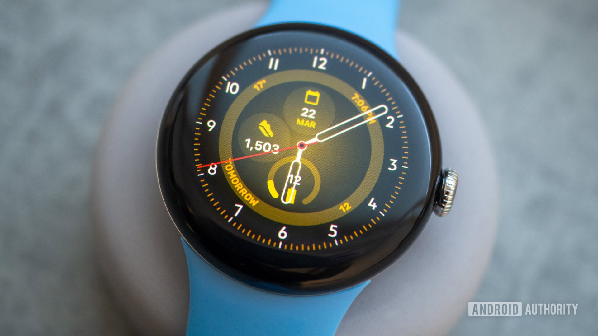
Moving on to my favorite analog watch face: Nothing Fancy by Time Flies Watch Faces. To be fair, though, it is quite fancy. I love the design and the bonkers number of customizations available here.
There are 30 color schemes, eight different indexes, five hands, eight always-on display options, and a setting to show or hide the seconds ticker.
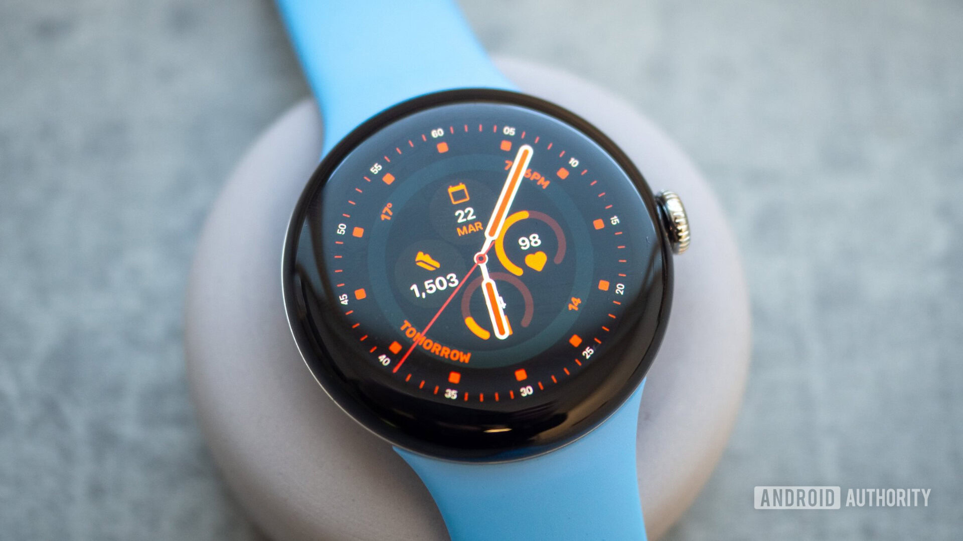
On top of that, you get eight customizable info slots — four big ones in the middle and four small text ones on the ring around it. I’ve been using this face for a while and I keep discovering new looks with it every time I try to customize it.
Rita El Khoury / Android Authority
My only issue is that it’s buggy and doesn’t always open in the Pixel Watch app. When that happens, I have to do all the edits on my wrist, and that gets tedious and clunky when you have 30 color schemes to scroll through. Small price to pay, though, for such a fantastic analog watch face..
Pixel Watch 2 Face I by SOC Creations
Rita El Khoury / Android Authority
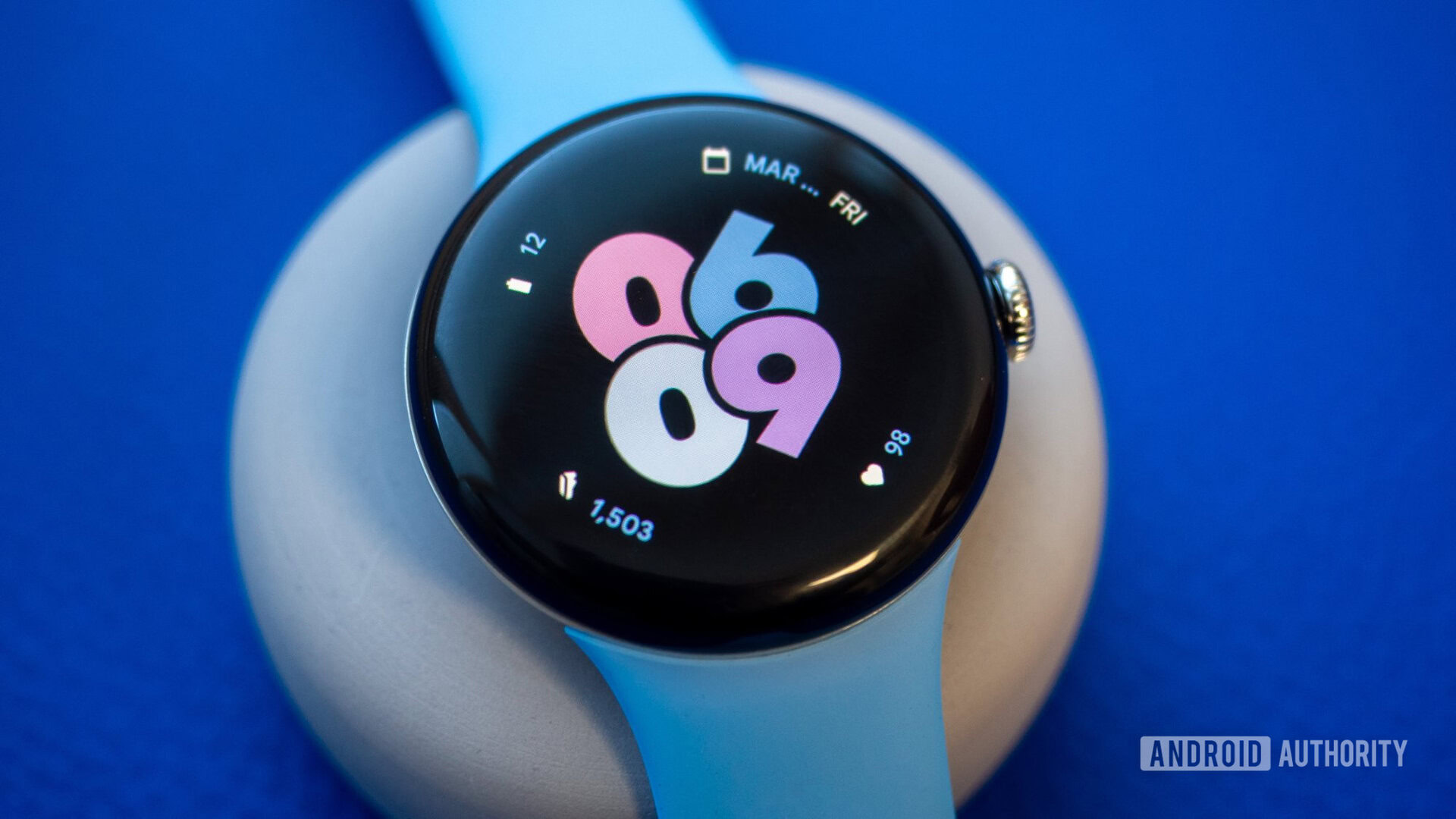
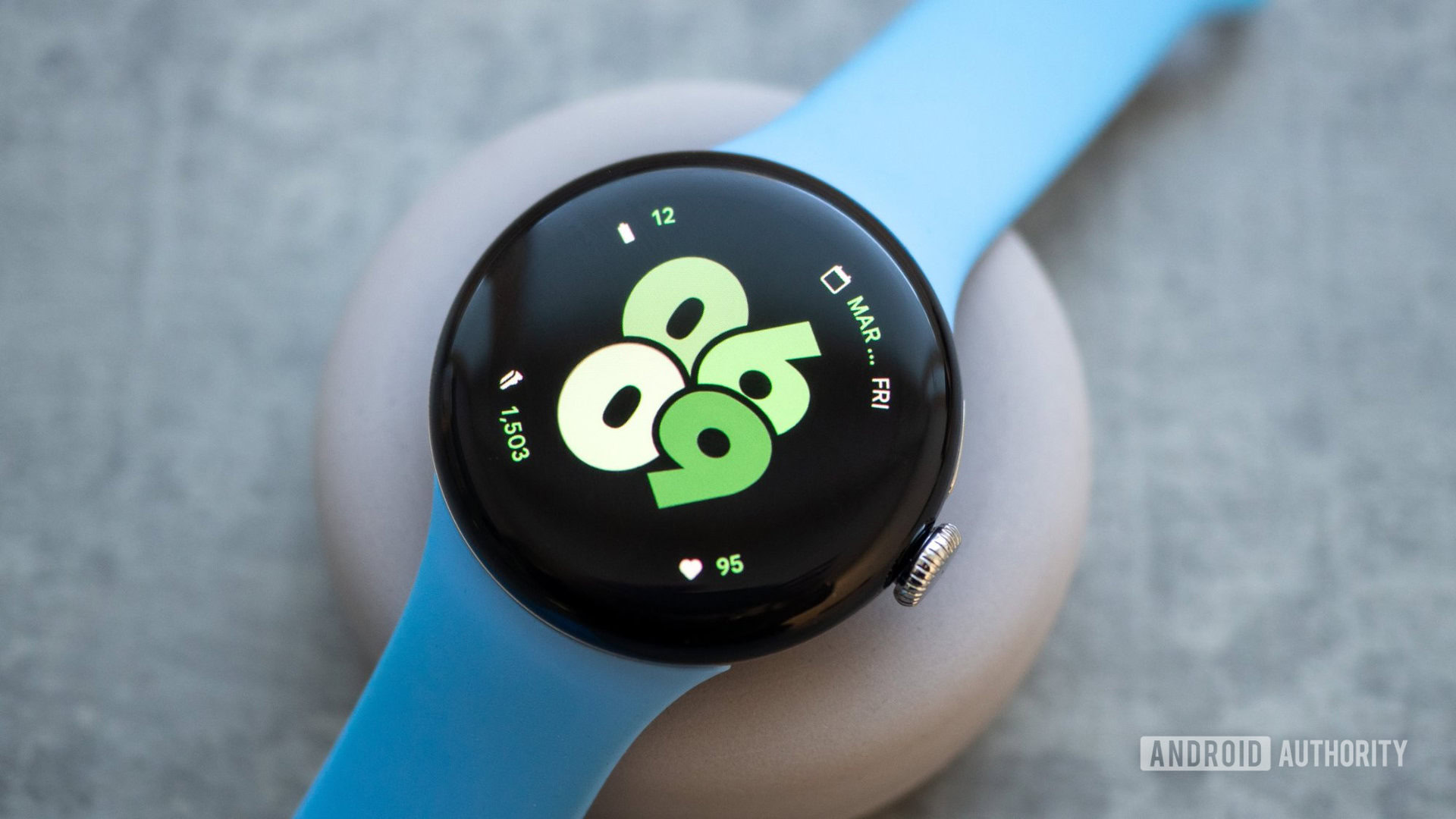
The next watch face by SOC Creations is very — uh, how do I say this — Google-inspired. Pixel Watch 2 Face I is perfect for me, though, because I really like the official Digital Bold watch face on my Pixel Watch, but I wish it had more info in it.
This watch face adds four customizable complications around the original design. I chose to show the date, battery, steps, and heart rate; that’s everything I need.
Rita El Khoury / Android Authority
There are 18 color options here, and the always-on display shows everything but in a battery-friendly way. A 10 out of 10 all around.
Minimal Digital Watch RE02 by Recreative Watch Faces
Rita El Khoury / Android Authority
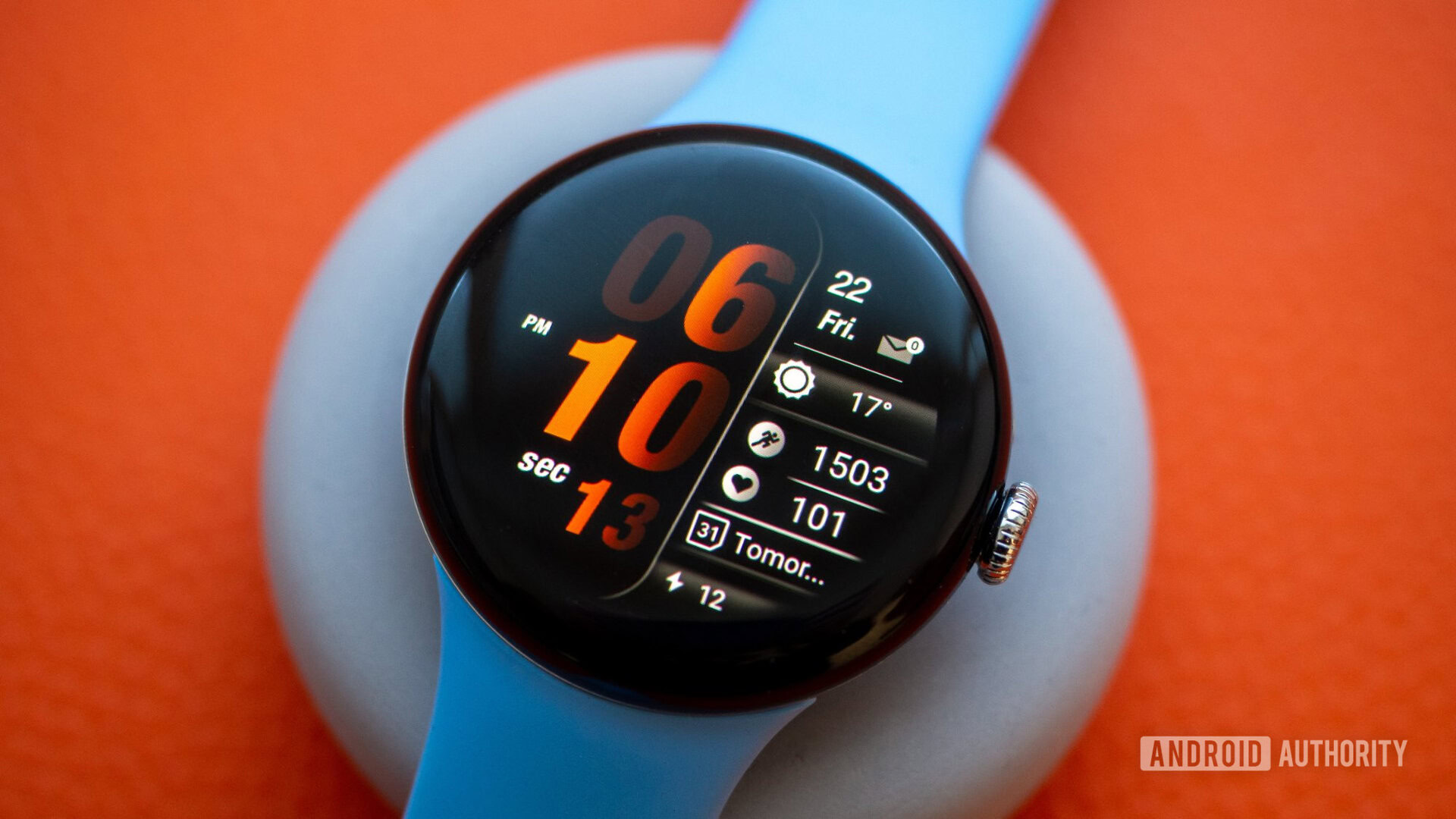
But some data slots are locked: The date, notifications, steps, heart rate, and battery can’t be changed. Once again, though, these are all complications I personally choose to show on any watch face I’m using, so the fixed choice works for me.
I usually go for the weather and Next Event complication in the two empty slots. You also get two app shortcuts on the left that you can show or hide. The seconds ticker can be turned off, and the always-on display is simple with the time, date, and battery.
Analogue Watch Face CRC082 by Creation Cue
Rita El Khoury / Android Authority
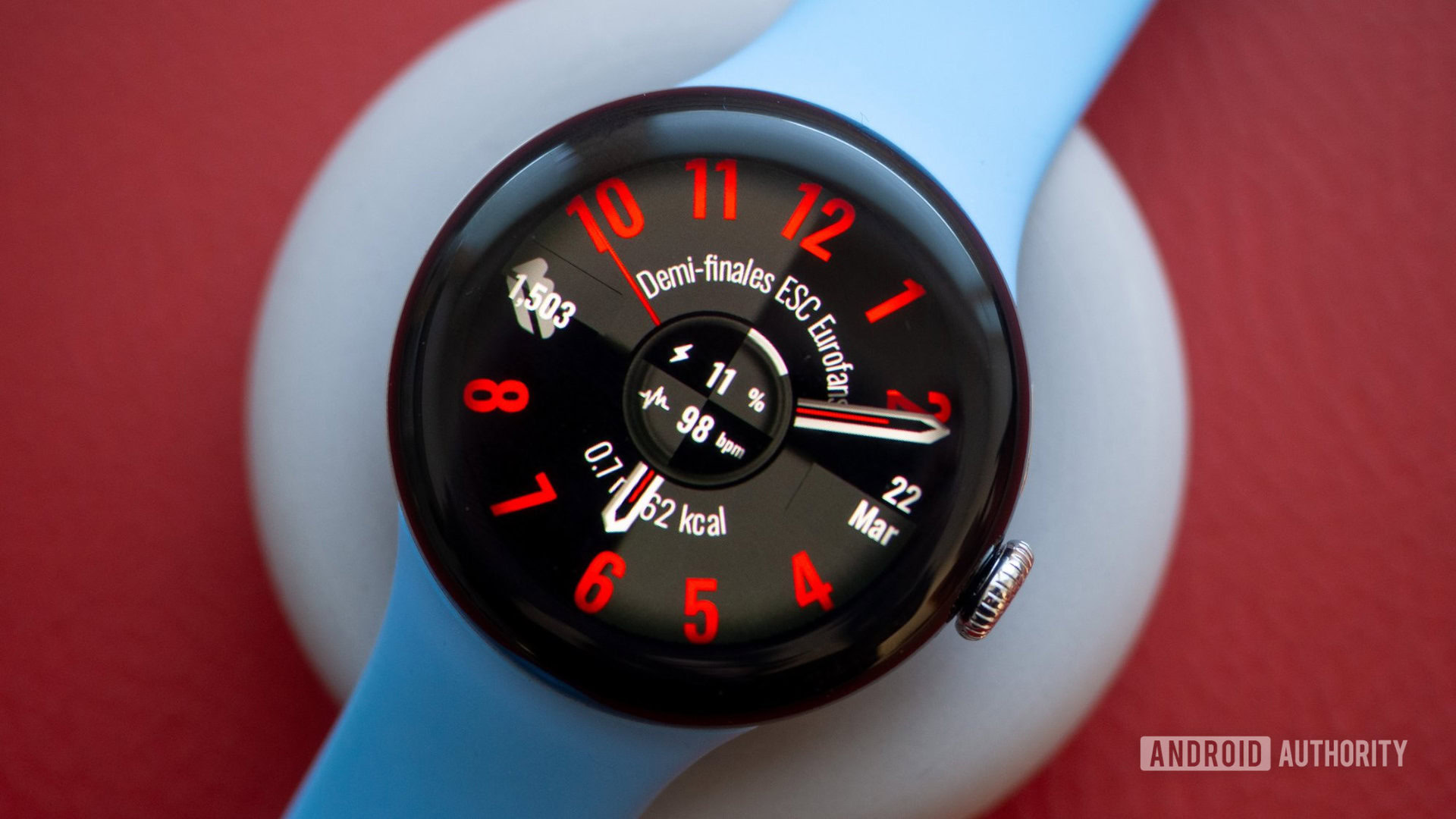
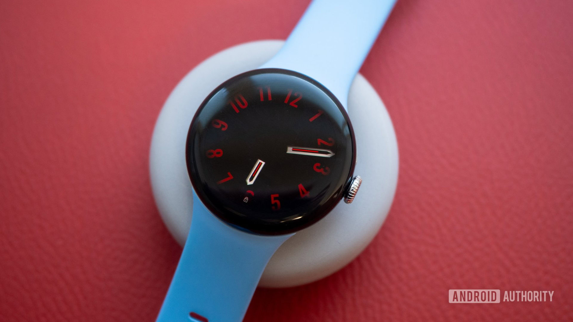
I like the inner shadow around it, which blends the bright index numbers perfectly into the black bezels of my watch. The clock hands aren’t the best, but being able to assign a different color to them is a nice perk.
Rita El Khoury / Android Authority
The complications in the middle are sadly fixed to the battery, heart rate, distance, and next event, but you can add four different complications on each side. I find that too busy, though, so I usually go for the left and right side only, leaving the top and bottom empty. If you ask me, it’s the big dial numbers that make this watch look good, so removing more of them ruins the look.
Material Stack by JH Watchfaces
Rita El Khoury / Android Authority
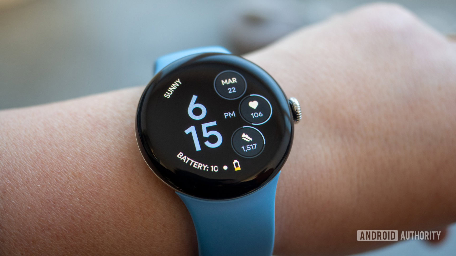
Going back to the Google inspiration, Material Stack by JH Watchfaces looks like one of the official Pixel Watch faces but with two extra complications and two shortcuts on the left side.
Everything is customizable here, and it can get a bit busy if you fill every slot, so I usually keep the shortcuts empty. But I like that I have the option to go overboard if I need more. My only request would be a simpler always-on-display without the left-side complications and shortcuts. Right now, everything is visible when the watch is off and I find that too crowded.
SG-128 by SG WatchDesign
Rita El Khoury / Android Authority
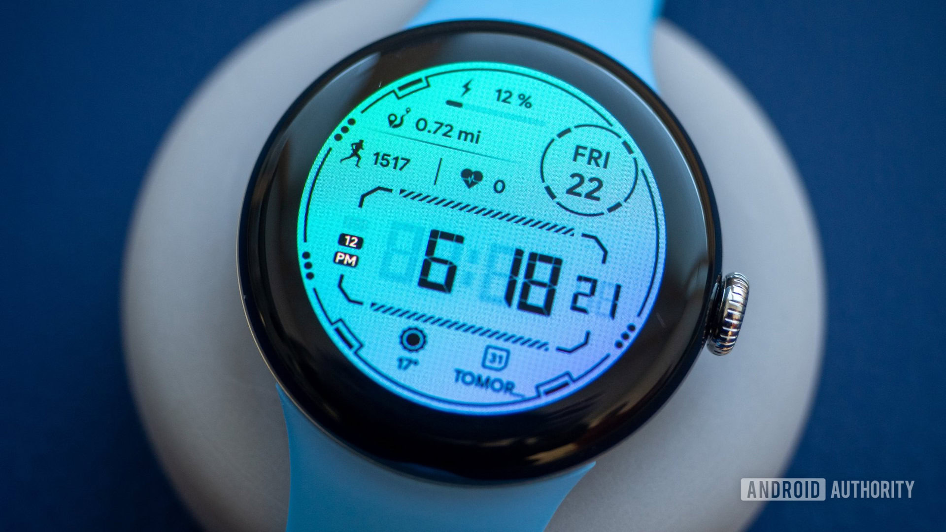
The gradient colors and patterned background on SG-128 by SG WatchDesign look very similar to the first design I showed you. Once again, these make this watch face pop when it’s on. It’s just gorgeous.
There is a ton of info here, but the thin fonts and lines help a lot in keeping the design sleek. Sadly though, almost everything is fixed in this watch, so you have to be OK with the battery, date, distance, steps, and heart rate showing up at all times.
Rita El Khoury / Android Authority
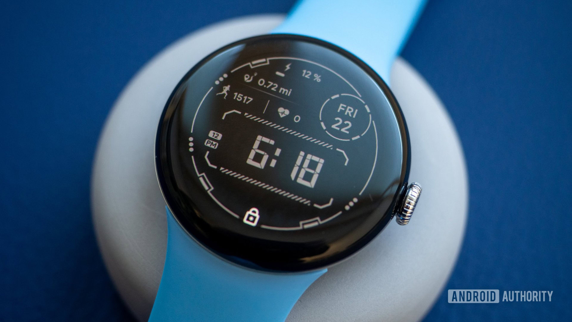
You get two customizable complications on the bottom and three app shortcuts, though. And the always-on display is very well done: You can’t beat the simplicity of white on black.
Typograph by WatchFace-Designs
Rita El Khoury / Android Authority
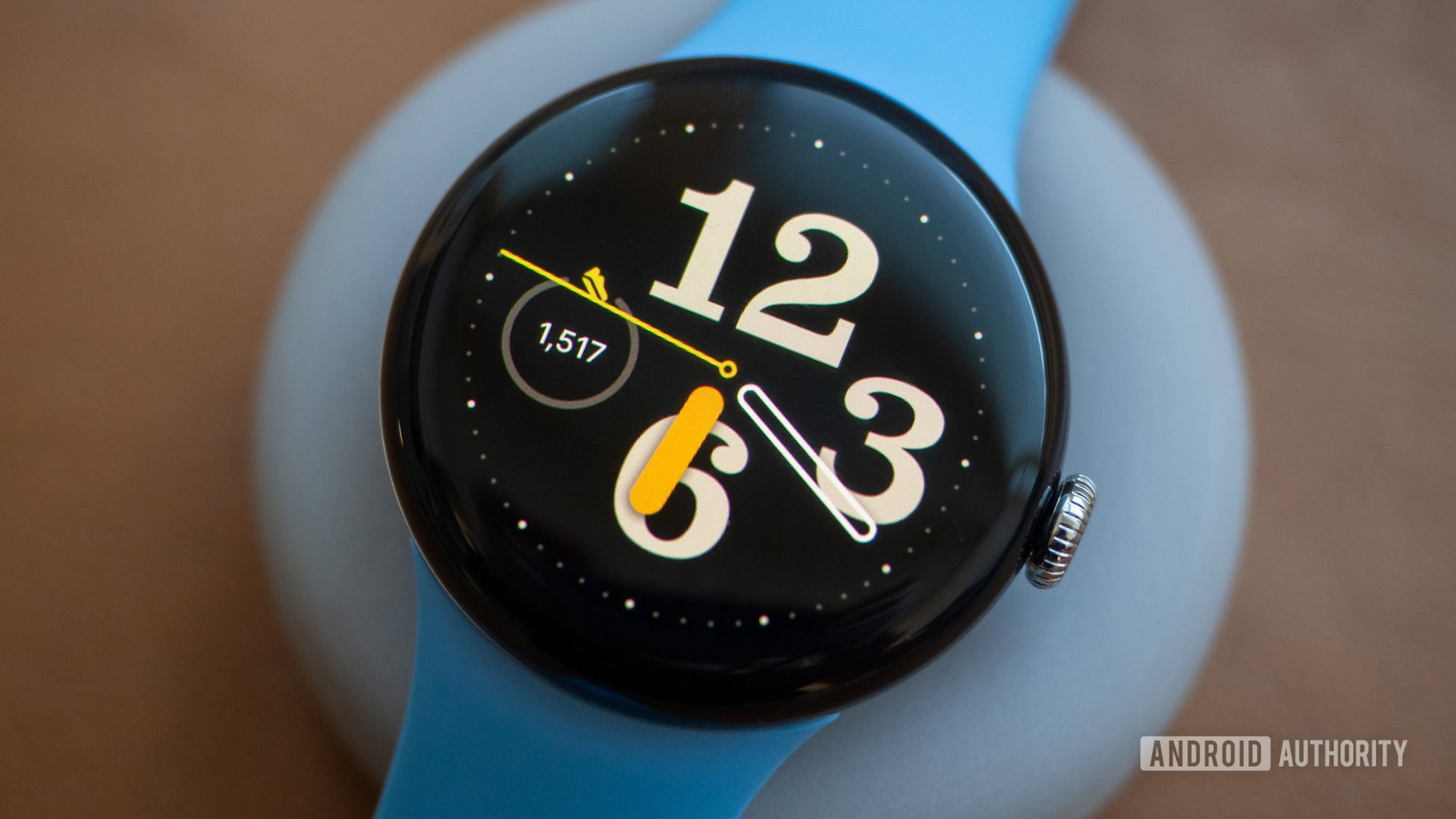
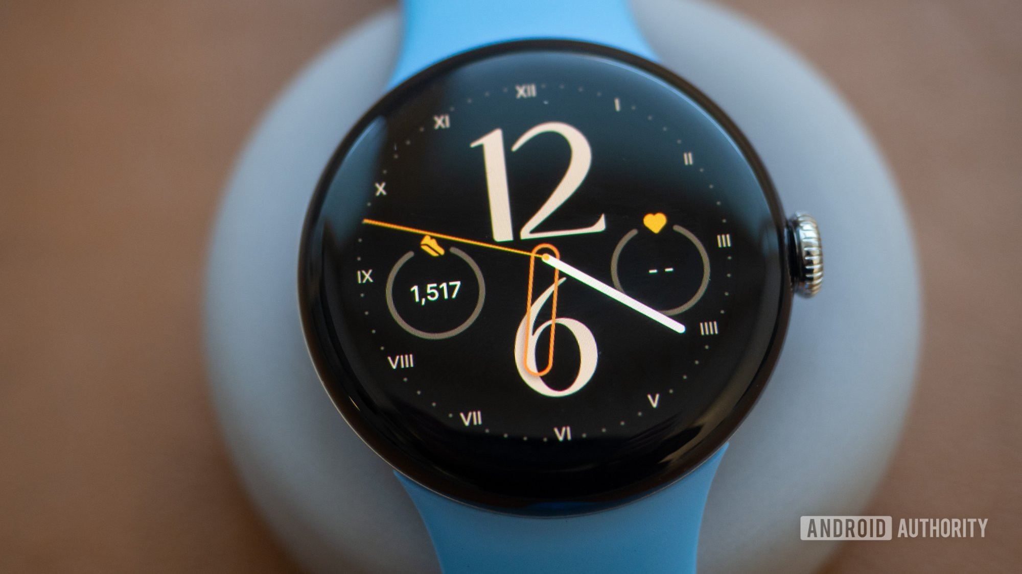
Typograph by WatchFace-Designs is the simple but very customizable analog watch face everyone should have in their collection. You get eight clock fonts, six index styles, two hand shapes, 20 color themes, and three customizable complications.
Rita El Khoury / Android Authority
I like that I can go from a classic font to a funky one to a simple one very easily and that the always-on display keeps the font and index choices. I would’ve loved a few extra choices for the clock hands, though.
Prime Home OS 2 by Prado Design Watch Faces
Rita El Khoury / Android Authority
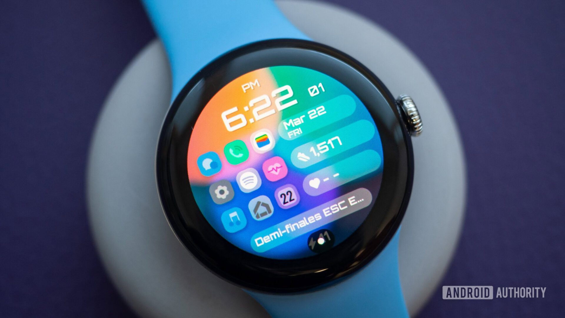
The Prime Home OS 2 watch face by Prado Design® is made for anyone who needs a lot of shortcuts on their watch. There are nine of them here, though six are fixed to messages, calls, settings, heart rate, music, and the calendar. Only three of the shortcuts are customizable, plus the three complications on the side and the one on the bottom.
What I like here is that the background isn’t one solid color and that there are 10 different icon packs to choose from so the look can change drastically between one design and the other.
Rita El Khoury / Android Authority
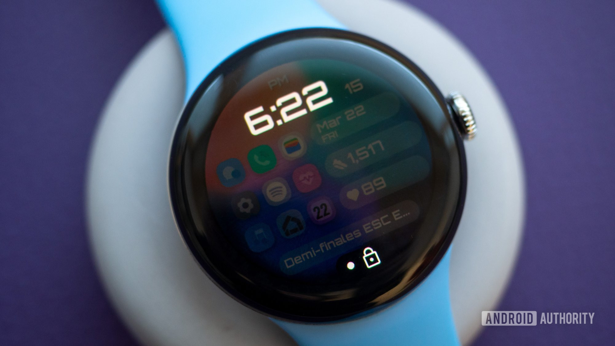
The always-on display could be a bit more elaborate, though. Right now, it’s just the time with a black overlay on everything else.
Pixel Fanboy by Dobleuxyz
Rita El Khoury / Android Authority
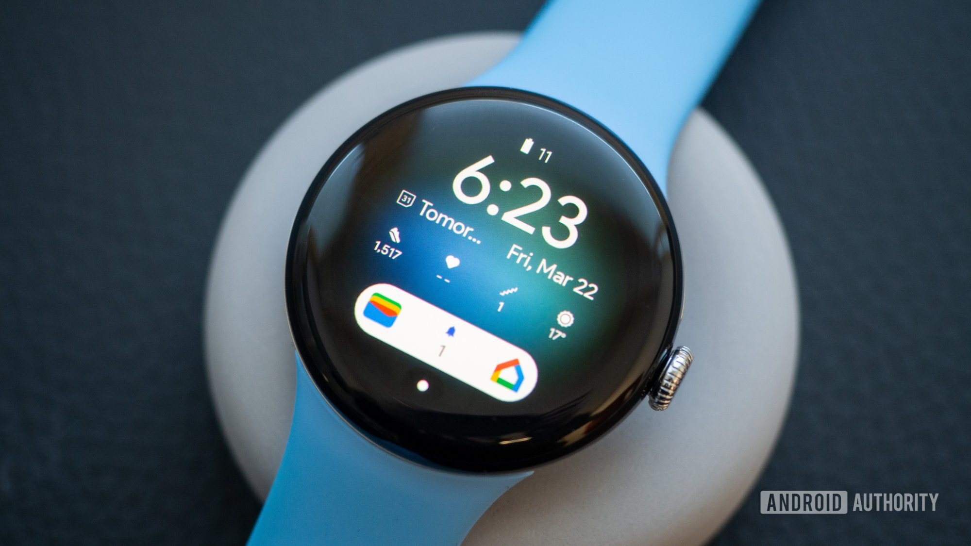
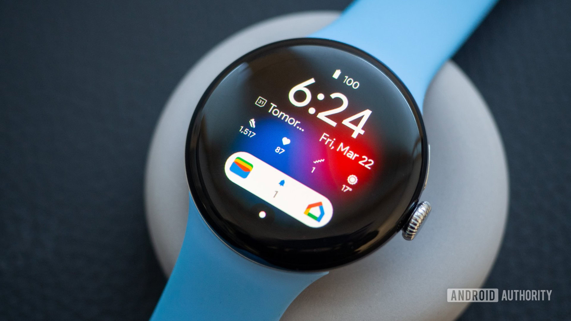
The last watch face, Pixel Fanboy by Dobleuxyz isn’t overselling its name. Between the fonts, the pill shape on the bottom, and all the different colors, this always makes me feel like I’m looking at my Pixel 8 Pro’s homescreen. There’s even an all-dark mode if you prefer that!
I love how dense this face is, without looking too busy, and how customizable everything is. The battery and date are fixed, but everything else is yours to choose from. That’s eight different slots to customize, between icons, stats, and text.
Rita El Khoury / Android Authority
And there you have it: 10 different watch faces, all unique in their own ways. For now, these faces have gone into my personal rotation, but I recommend you check out the developer pages of each of these because they’re doing great work. And there are many, many other options to pick from.
Watch Face Format is still relatively new, though, so I hope we see even more watches and more developers using this format in the future.


